How often do you walk into a store just to buy bread and milk and come out with frozen peas, ice-cream, pasta sauce, chocolate doughnuts, coffee, chips and cold drink – and no bread and milk? There is a very good reason for this. It’s because store owners are cunning and manipulative and they layout their stores to maximise sales. Store layout is actually pretty scientific with five standard tried and trusted designs.
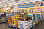
- Straight floor plan: This is most often employed by supermarkets, as the straight shelves and wide(ish) aisles allow free movement and encourage browsing.
- Diagonal floor plan: According to Management Study Guide, this is favoured by stores with direct access, as it allows managers to keep an eye on customers. Garage quick shops often use this layout.
- Angular floor plan: This is often used by boutiques as it lends an elegant feel to the store.
- Geometric floor plan: This is used by stores that want to appear trendy, such as youth clothing stores and sports stores.
- Mixed floor plan: Management Study Guide says that this is the most functional layout.
3 More store layout tips
The more time that customers spend in a store the more products they are likely to buy and the more money they are likely to spend. It’s obviously in a store owner’s best interests to pay careful attention to layout to encourage shoppers to walk the length and breadth of the store. Here are three tips to ensure that your customers not only spend more money in your store, but that they also have a good time doing it.
- The layout must be customer-friendly. The width of your aisles is particularly important in this regard. It’s recommended that the aisles be wide enough to fit two shopping carts, and then some. There is very little that puts off shoppers more than having to manhandle their carts and weave their baskets around other shoppers. Now, you can’t do anything about the inconsiderate people who park their carts in the middle of the aisle, but you can give shoppers room to navigate these moveable chicanes. Shelf height is another consideration. Shoppers don’t want to crane to see the top shelf, and they don’t want to have to jump awkwardly to try and hook something just out of reach. Jack Sweet (David L. Hawkins Design Management) says that you should put the products you most want to sell (the popular products) at eye level.
- Use your displays wisely. Your windows are ideal for displays; product displays, banner displays and competition displays. Don’t make them too cluttered, however. You can also use displays in-store to exhibit products, but proper placement is crucial. Don’t block aisles or stick them in otherwise obstructive places. Ensure that whatever displays and signs you use are professionally designed. Rick the supply manager may have admirable artistic skills, but resist the temptation to ask him to create a display banner. Your customers will know that you’ve skimped and they will think you’re cheap.
- Arrange your shelves so that related products are near to each other. Department stores do this well. For example, shoes and hosiery are usually alongside each other, with handbags and other accessories a short hop away. Supermarkets do this when they place pasta near pasta sauces, which are in the same aisle as other sauces, marinades and salad dressings, which are near condiments, such as olives and pickles.
If you’re going to open a retail store or showroom of any kind, you need to spend a lot of time researching different floor plans and experimenting with layouts before you hit on something that works for you. Just remember that you need to keep analysing things like foot traffic and ROI so that you can make changes to maximise sales and customer satisfaction.
Sandy Cosser writes for a South African-based exhibition display specialist with solutions for a wide range of events, including conferences, product launches and in-store promotions